Paint is the cheapest change you can make in a flip, and the wrong colour quietly kills a listing photo. After painting more rentals than we can count, we've learned that colour in a short-term rental isn't about self-expression. It's about photographing well and appealing to as many guests as possible. Here are the colours that actually work, and how to use them.
Paint Is the Backdrop for Your Photos
In a rental, paint isn't decoration so much as the backdrop for every listing photo and every stay. It has to flatter the space, suit the warm lighting, and appeal across every guest's taste. That reframes the whole colour decision: you're not choosing a colour you love, you're choosing one that photographs as somewhere thousands of different people would want to stay.
Warm White Wins
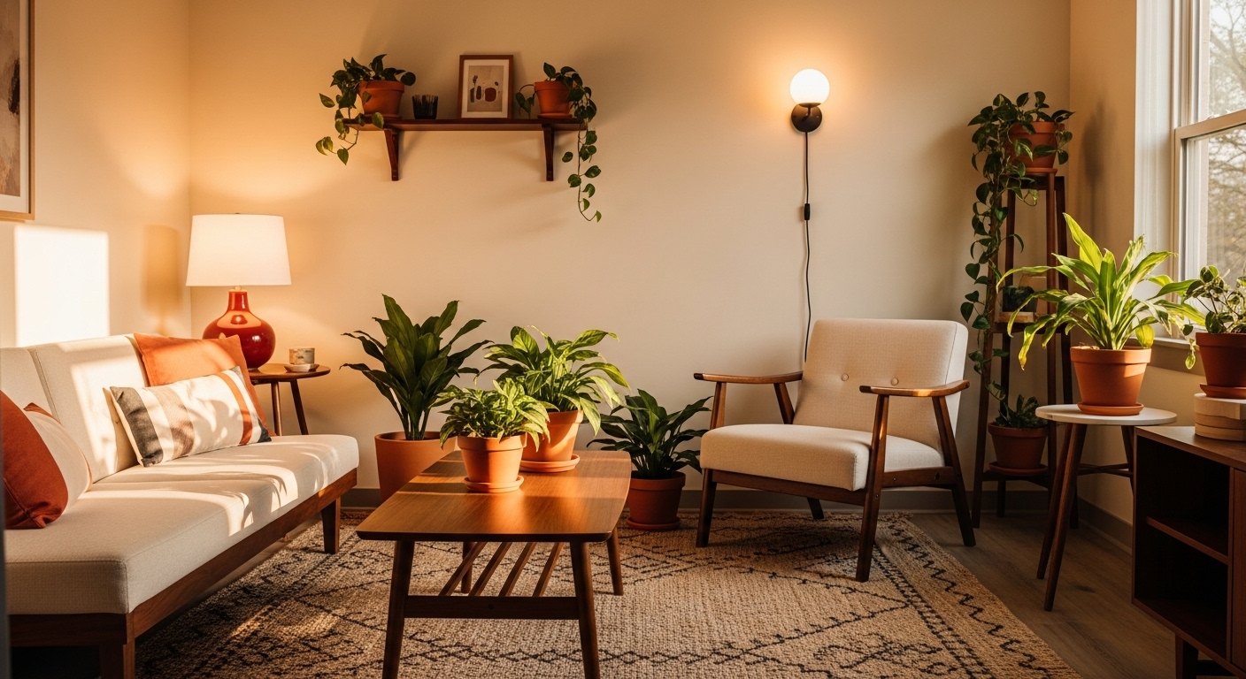
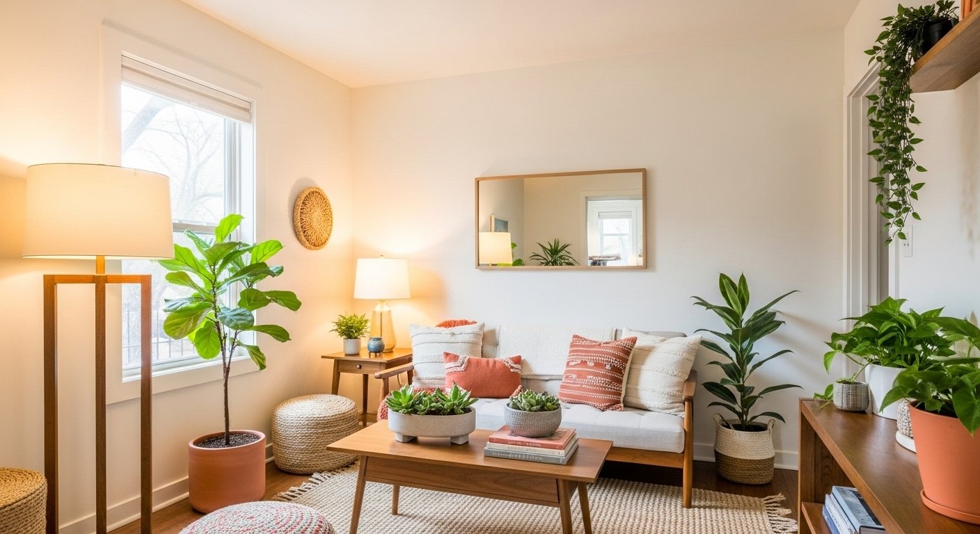
The safest, most photogenic choice is a warm white throughout. It lifts dated rooms, suits every guest, gives your warm lighting a clean canvas, and reads as inviting in photos. Crucially, it's a warm white, not a cool or stark one, warm whites photograph cozy while cool whites can look clinical and grey, especially in the lower light of an evening photo.
Why Cool Whites Fail in Photos
Cool, blue-leaning whites are a common rental mistake. They look crisp on a swatch but read as cold and grey in listing photos, particularly under warm bulbs, where they fight the light. Warm light over a cool white is a clash you can feel even if you can't name it. A warm white under warm light, by contrast, glows. Match the wall to the light.
One Considered Accent
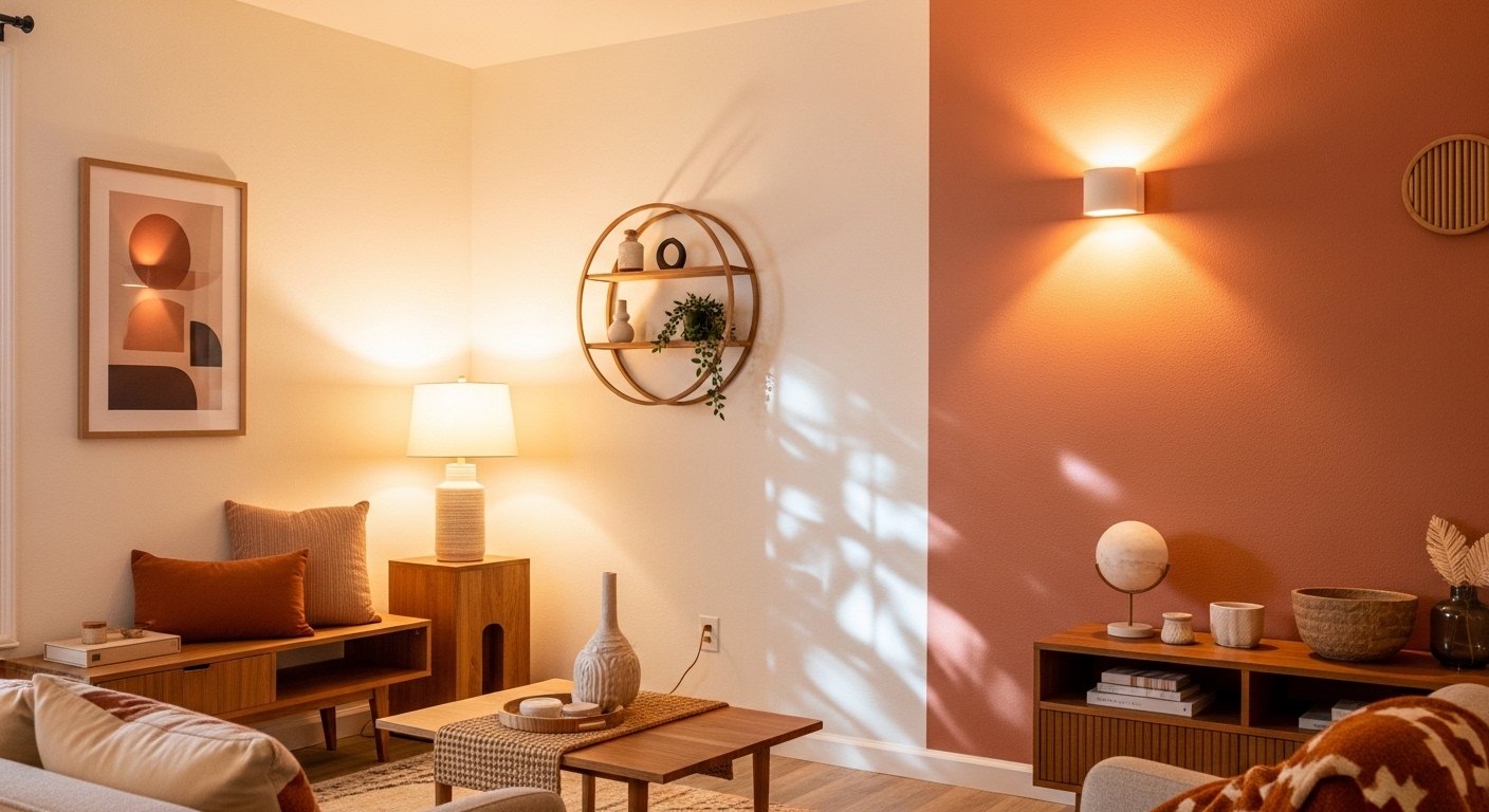
A warm neutral base can take one accent, a soft clay or muted green feature wall in the bedroom, say, for a cozy, photogenic moment. The key is restraint: one considered accent in one room adds character, while saturating a whole rental in bold or trend-specific colour risks alienating guests and dating fast. Keep the base neutral and the accents few.
Test in the Real Light
Paint shifts dramatically with light, so we test large samples on the actual walls and view them under the rental's own lighting, including the warm bulbs we'll use, at different times of day. A colour that looks perfect in the shop can read lavender or grey in the unit. What matters is how it photographs under your lighting, not how it looks on a swatch.
Let the Lighting Do the Rest
Paint and lighting work together: a warm white backdrop only glows if the light is warm too. We pair the paint with warm sconces, a soft pendant, and lamps on 2700K bulbs. The same warm white can look flat under cool light or lovely under warm. The colour is only half the equation, and the light is the other half.
Keep It Consistent
Across a rental, a consistent warm-neutral palette ties the whole unit together so it reads as one considered space in the listing photos rather than a patchwork. We use the same warm white throughout and repeat a couple of accent tones, which makes the apartment feel coherent and designed, exactly the impression that converts a browser into a booking.
Cheap, High-impact, Worth Getting Right
Paint is the cheapest renovation there is and one of the most important, because it sets the backdrop for the photos that sell your listing. Warm whites, one considered accent, tested in the real light and paired with warm bulbs. That's the whole formula for paint that photographs well and books out a rental.
Shop this post: wall sconces and modern pendant lighting
Our friend Karen at The Holloway Home is brilliant on getting paint colours right in a modern living room, her testing-in-real-light approach is exactly what we use before painting a rental.